

year / anno
2014
/
project by / progetto di
architetta Francesca Perani / architetta Sandra Marchesi
/
collaborators / collaboratori
Claudia Manenti / Laura Belotti
/
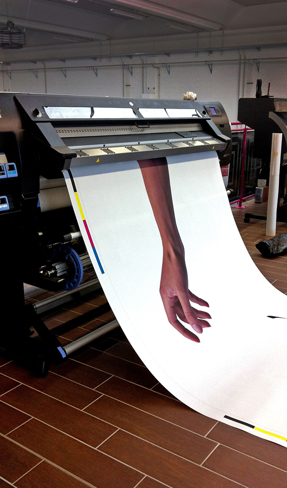
photo / foto
Francesca Perani
/
location / luogo
Italy – Milano
/
type / tipologia intervento
allestimento / set design
/
dimension / dimensioni
area surface: 6 sqms
building height: 3 m
/
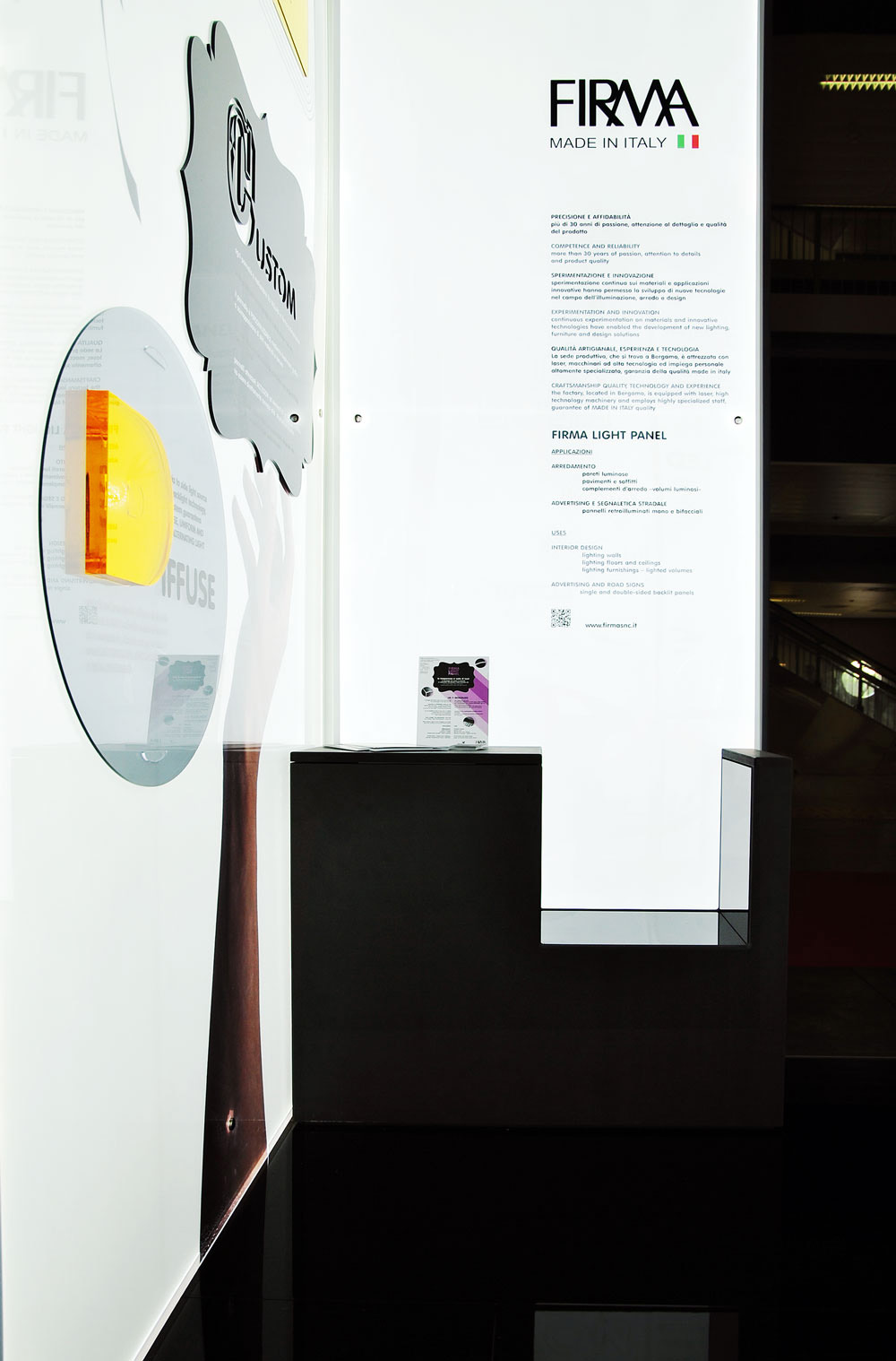
client / cliente
firma snc di Manenti
www.firmasnc.it
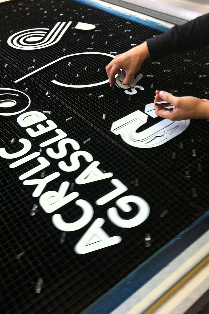
illuminazione backlight, lavorazione plexiglas, policarbonati e polistiroli
/
Status: completed
/
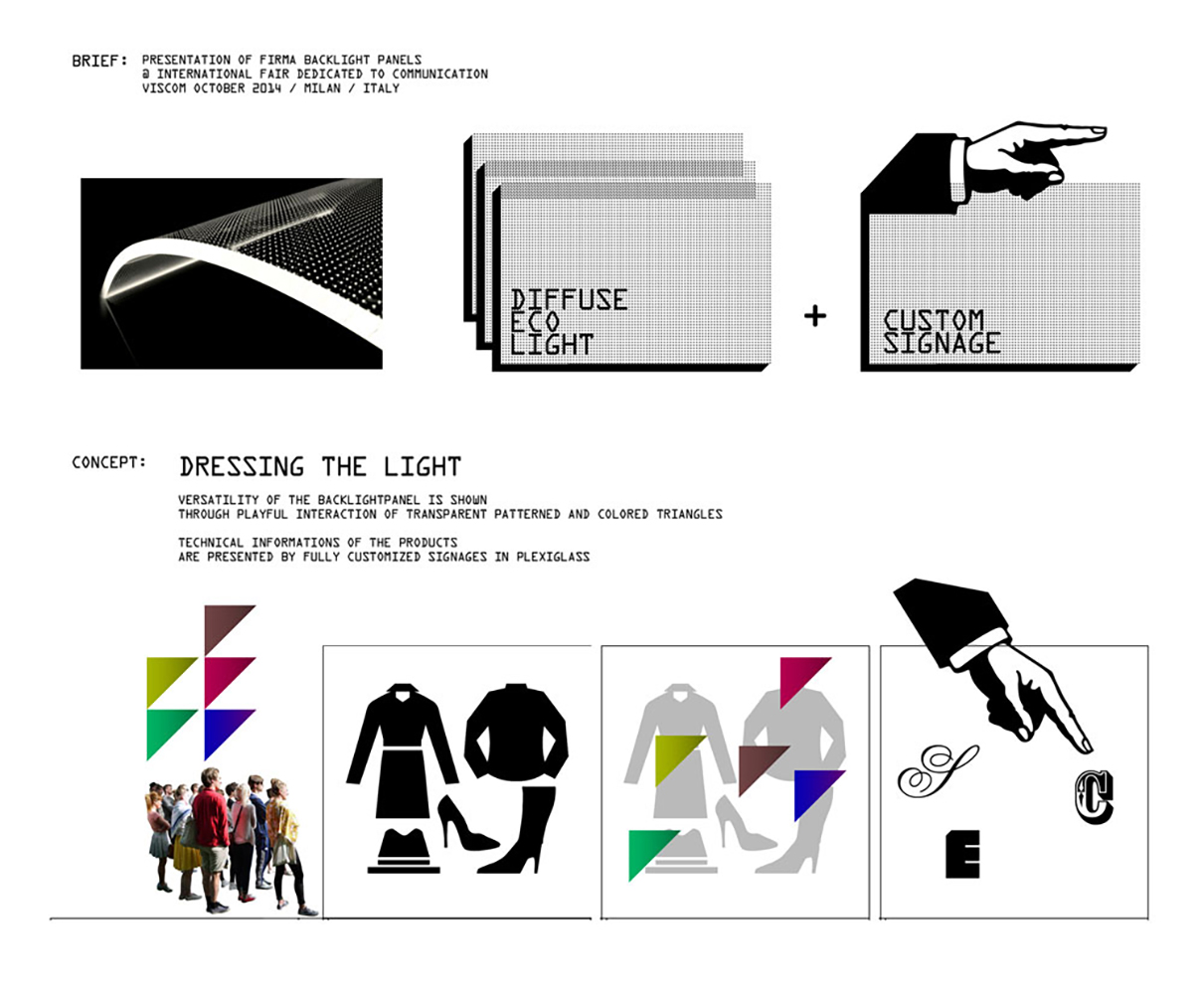
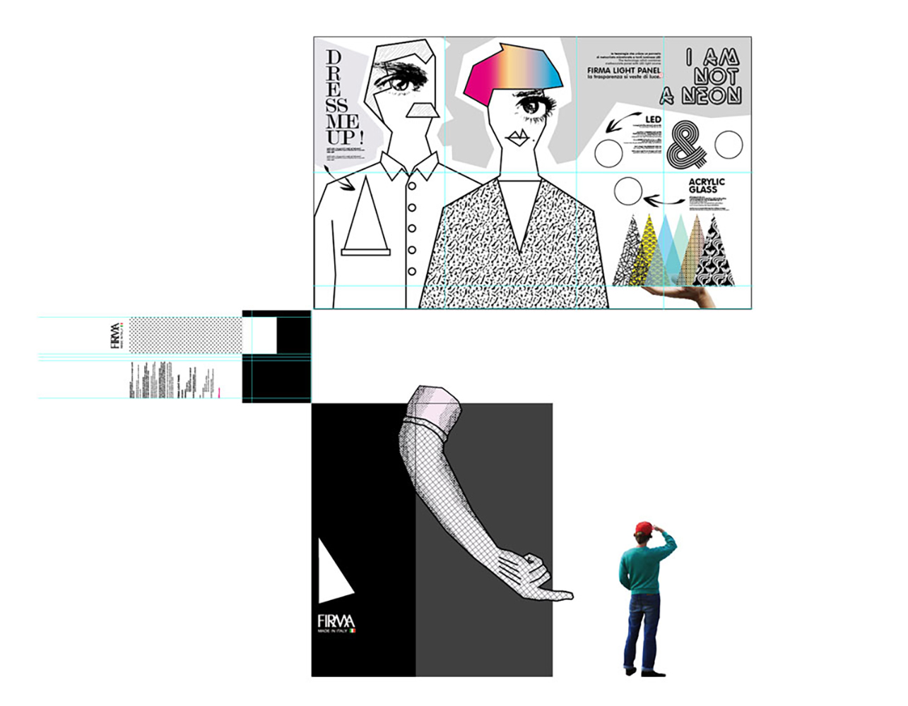
CLOTHING LIGHT
An eclectic character, with the right amount of retro and irony, emerges from the design project created for a stand at Fiera Viscom in Milan (International visual communication expo)
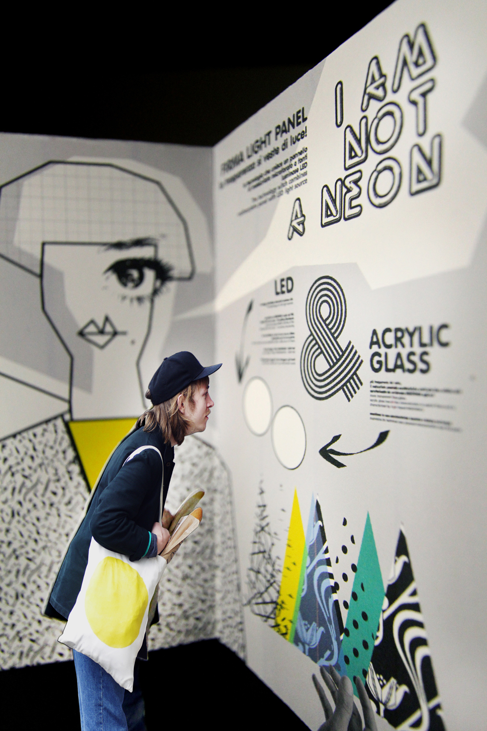
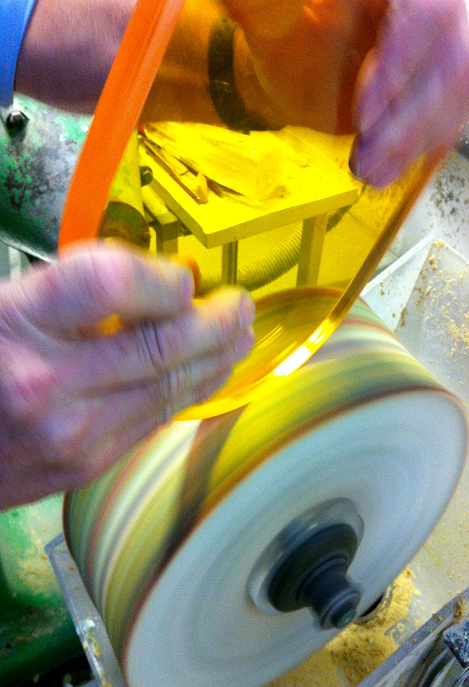
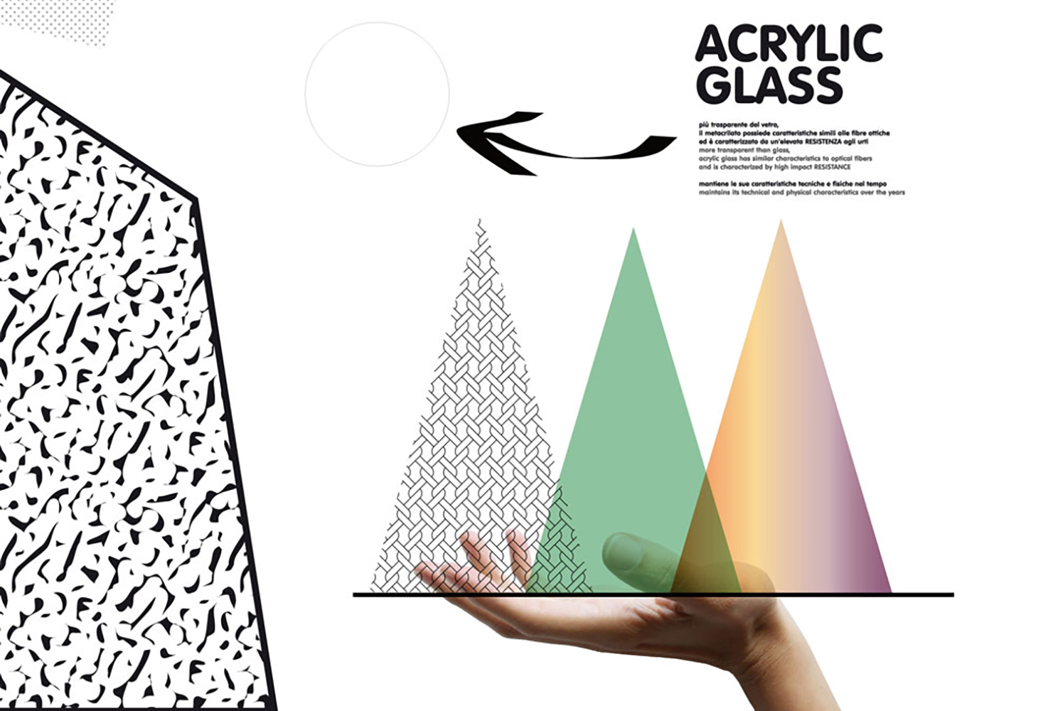
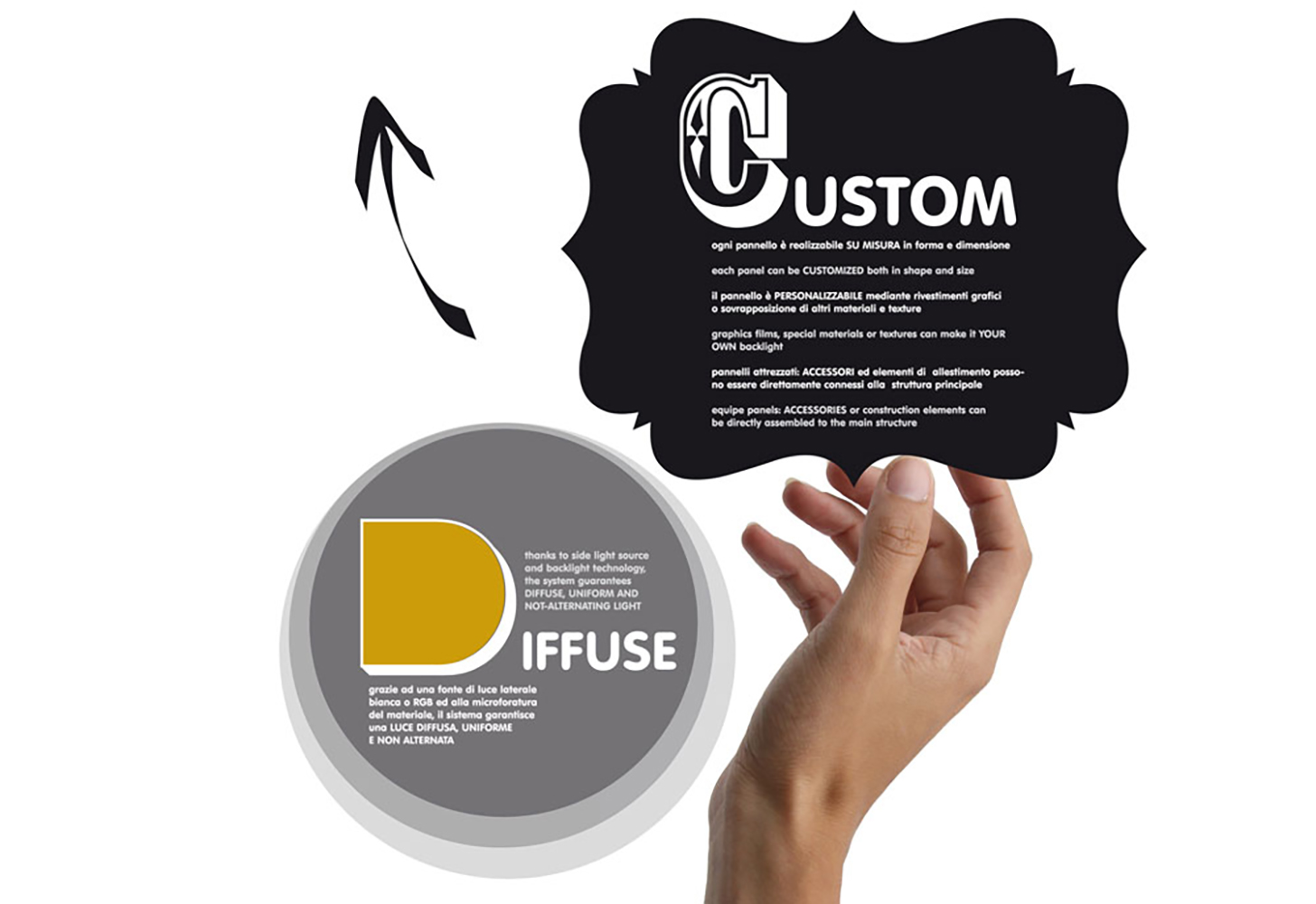
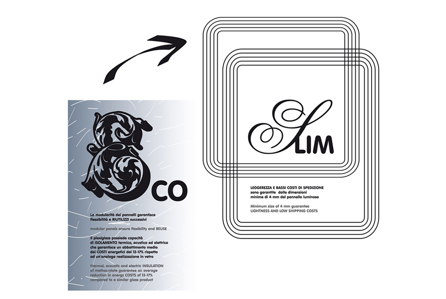
There were two main goals: firstly to explain the technology of lighting panels (sustainable, reduced thickness and great versatility), and at the same time to showcase the wide ranging manufacturing potential of the company(thermoforming, engraving, cutting, bonding etc.).
The concept of Clothing Light runs through the entire stand. Clothing it to make it concrete and tangible giving it a body and a personality. Understanding such a high tech product becomes an interactive game.
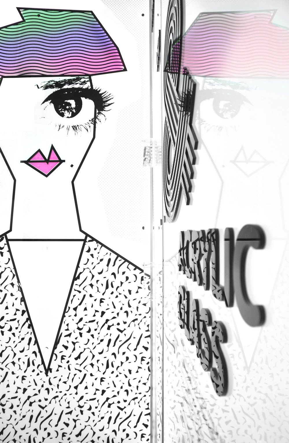
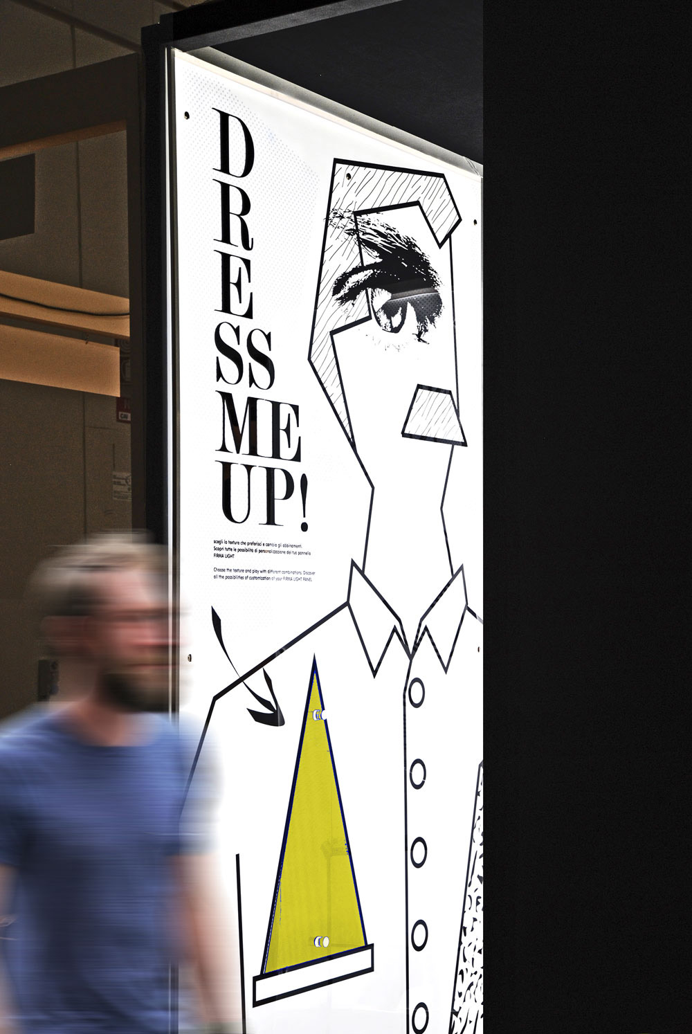
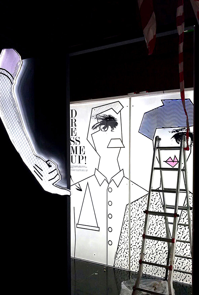
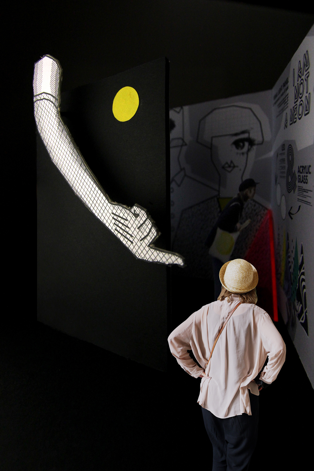
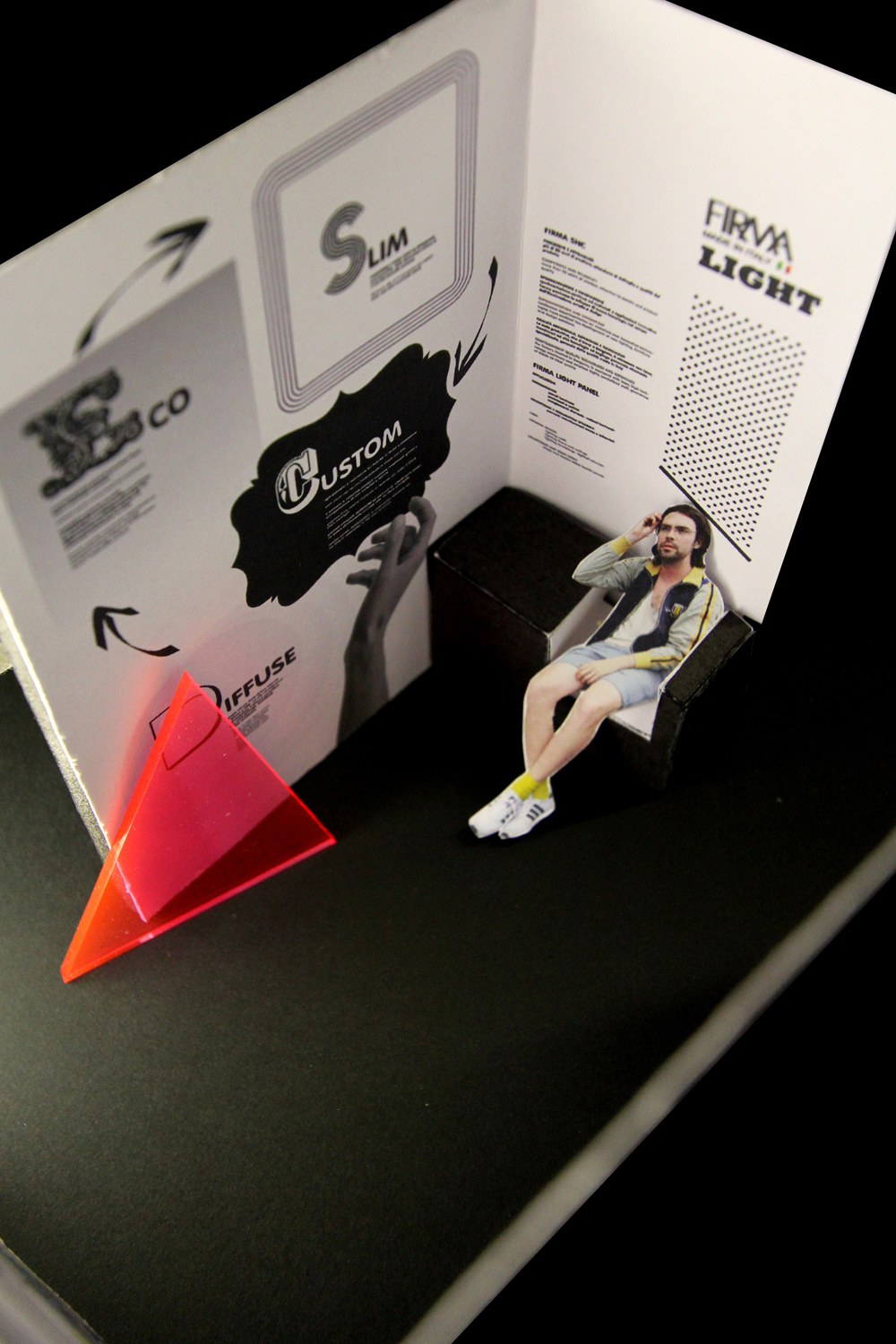
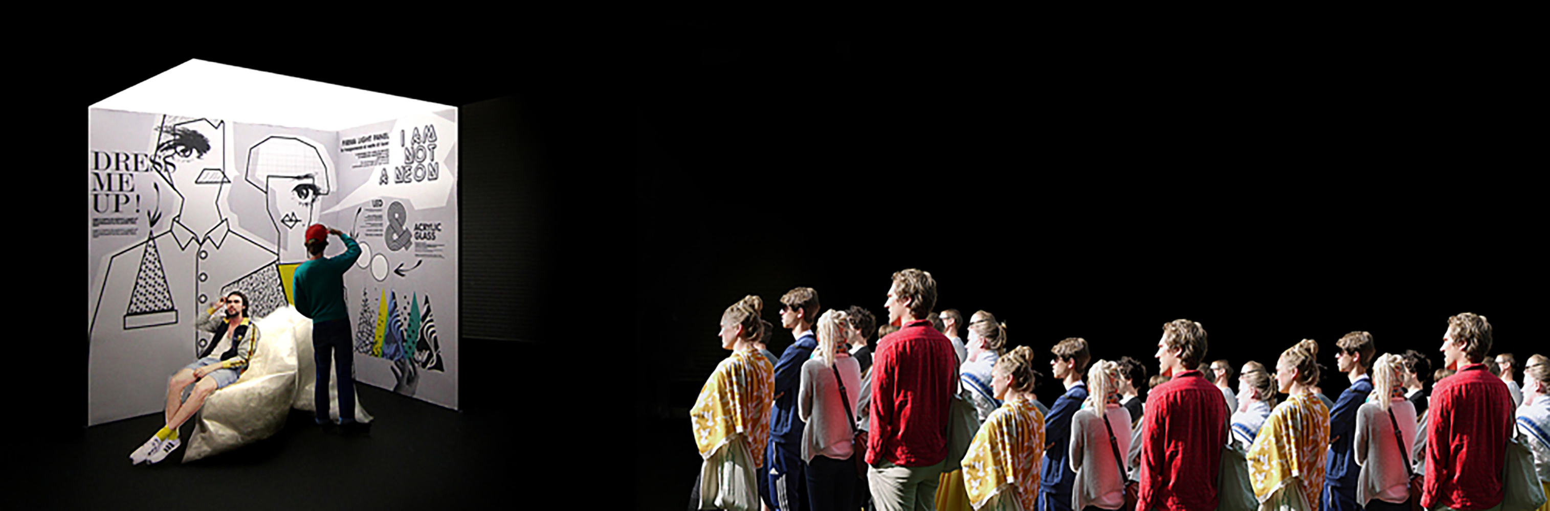
The Stand showcases the potential of backlight technology, emphasising light through its forms, its cut, but also its shadows. The display offers a tailored dress that the participating spectator is invited to enrich with colour and texture using triangular semi-transparent plexiglas masks which are easily positioned on all vertical surfaces. Thus the public becomes integral part of the design project.
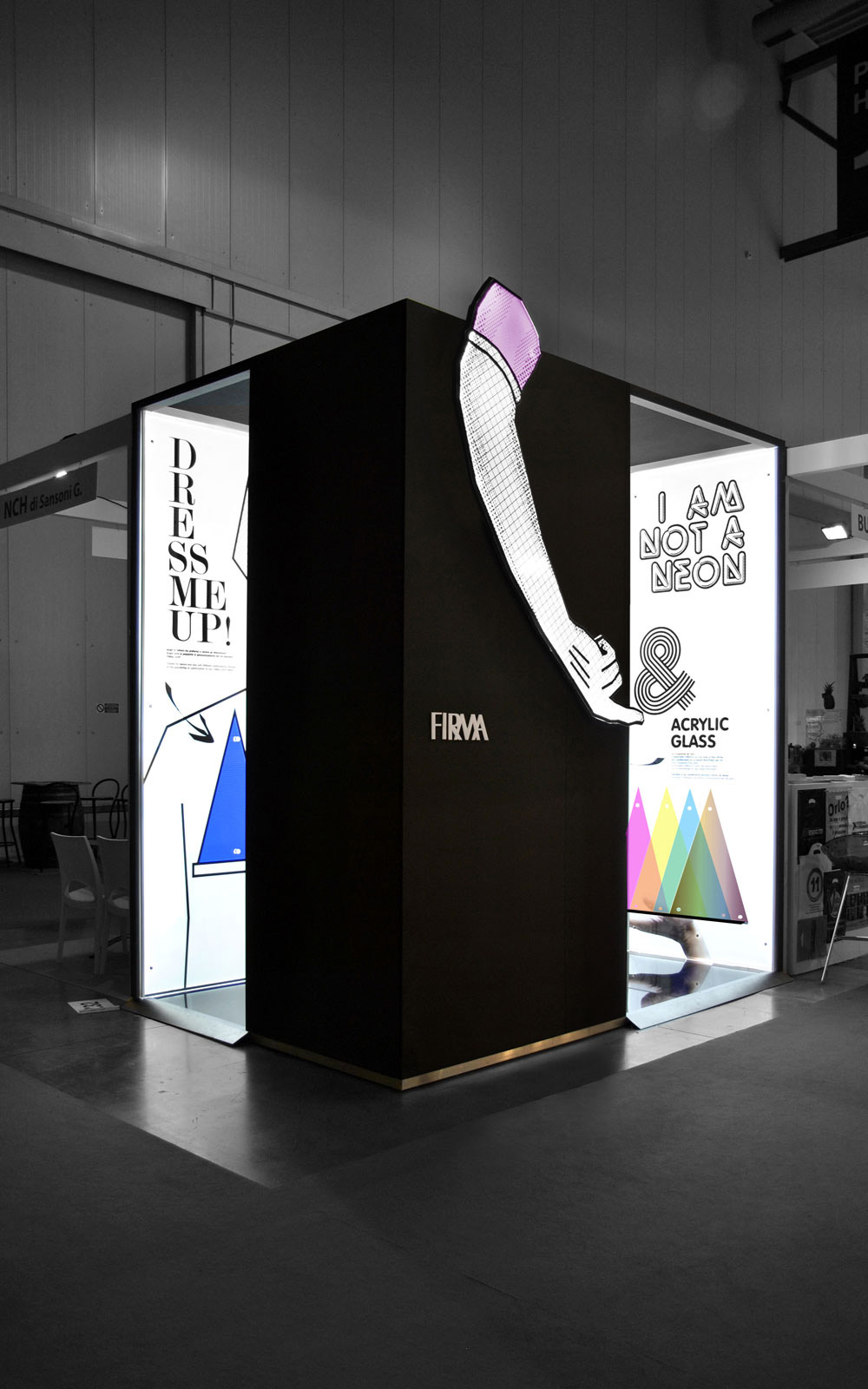
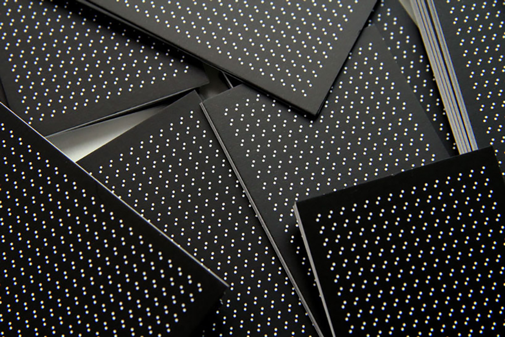
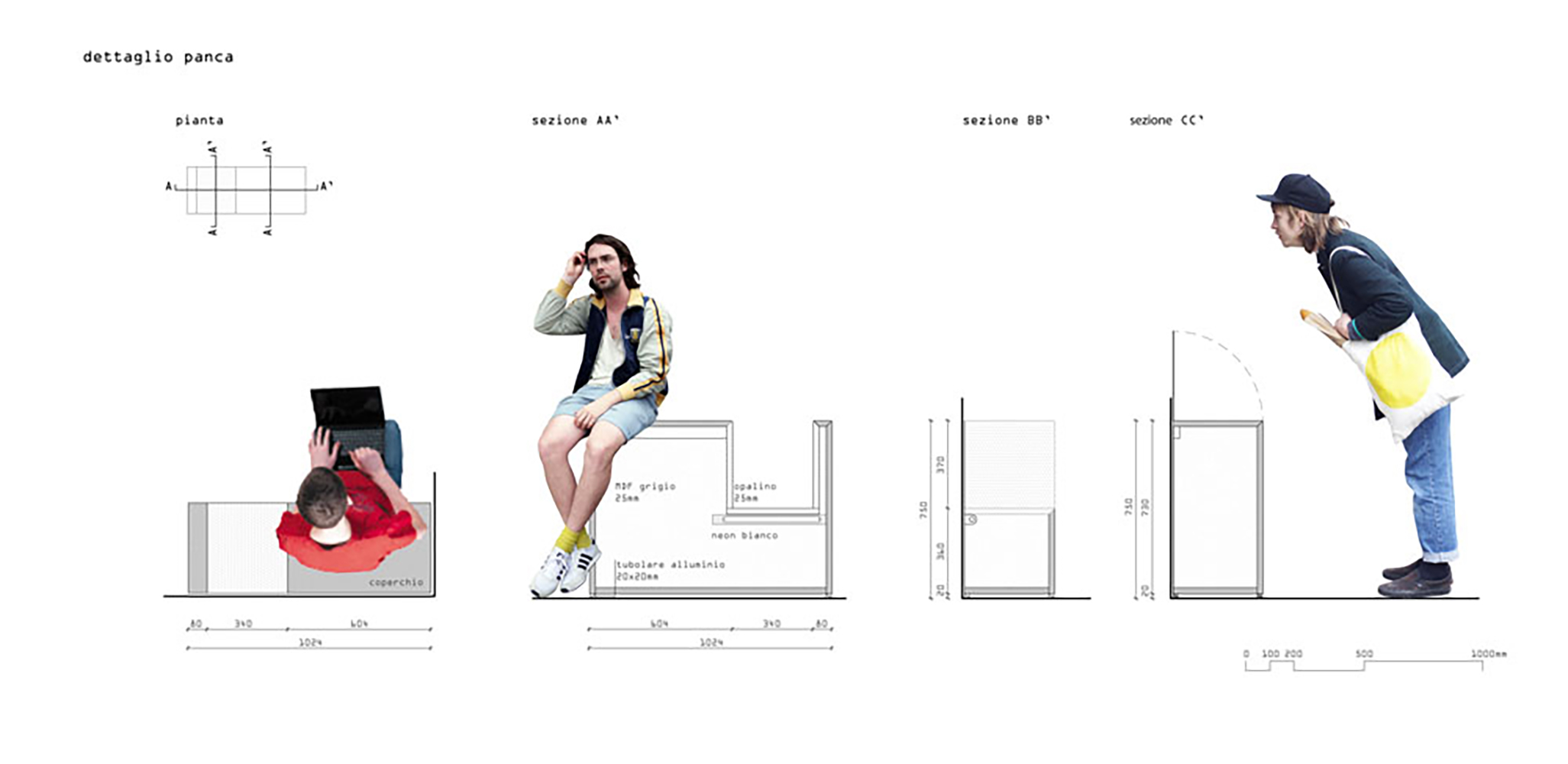
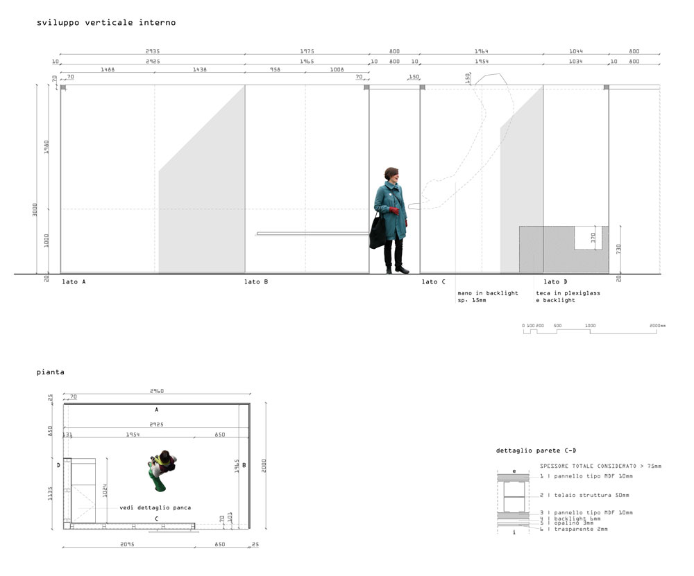
The small box (3x2m) has an opaque, anthracite colour outer MDF covering, which creates a strong contrast with the white, bright interior.
The peculiarity of the front, in the walk-through area for the visitors, is a 1920s-inspired luminous sign creating an unexpected surprise effect.
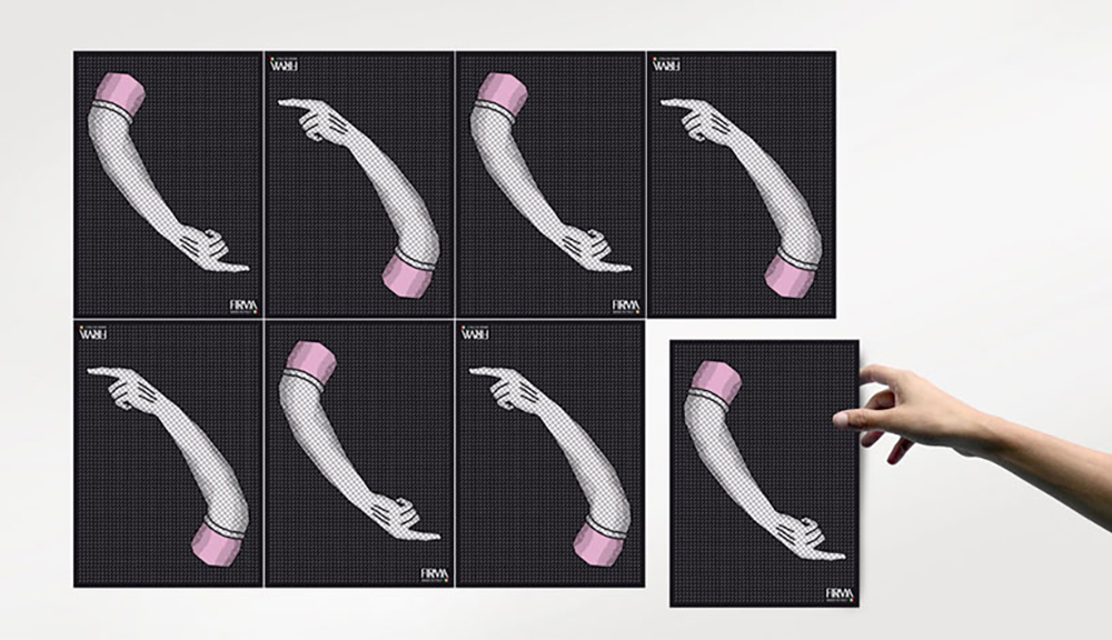
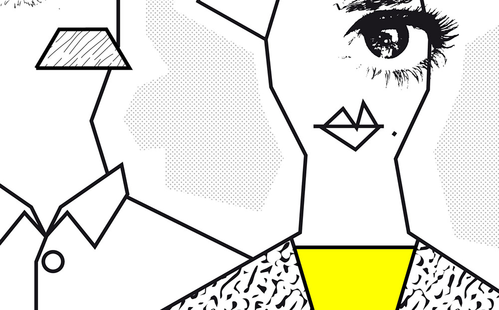
The covering of the luminous surfaces is an explosion of light clothed in quirky illustrations in a fresh and sharp style, outlining two great figures: surreal Cyclops to be dressed and desecrated. Impact graphics, characterised by a diversity of typefaces, emphasise the many technical solutions and qualities of the product.
The design for the stand is integrated: graphics have a central role. The ability in mastering scales adds much value to the design project, which can surprise at many levels: from the stand as a whole, to individual panels, to the brand image.
VESTIRE LA LUCE
Un carattere eclettico dal sapore retrò con la giusta dose di ironia emerge dalla proposta progettuale per lo stand realizzato alla recente fiera Viscom di Milano.
Due le esigenze principali: raccontare le caratteristiche tecnologiche del pannello luminoso (sostenibile, di spessore ridotto e grande versatilità), e rappresentare al tempo stesso le molteplici lavorazioni e potenzialità della società Firma (termoformatura, incisione, taglio, incollaggio, etc.).
Vestire la luce è il concept che percorre l’intero stand. Vestirla per renderla concreta e tangibile dandole corpo e personalità.
Il momento della conoscenza di un prodotto così altamente tecnologico è trasformato in un’attività ludica e interattiva.
Lo stand mostra la tecnologia Backlight con le sue potenzialità, esaltando la luce attraverso le sue forme, il suo taglio ma anche le sue ombre. Un abito disegnato su misura che lo spettatore attore può decidere di arricchire di colori e texture grazie a maschere semi trasparenti triangolari in plexiglass, facilmente posizionabili su tutte le pareti verticali.
Il pubblico è reso così parte integrante del progetto.
La scatola di piccole dimensioni (3x2m) si presenta all’esterno con un rivestimento di MDF color antracite opaco, che crea un forte contrasto con l’interno bianco e luminoso. Peculiarità della zona di percorrenza rivolta al visitatore è l’insegna luminosa che reinterpreta quelle anni ’20 e crea con la sua macro dimensione un effetto sorpresa inaspettato.
Il rivestimento delle superfici luminose è un’esplosione di luce vestita di illustrazioni originali dal tratto fresco e tagliente che delineano due grandi figure, ciclopi surreali da vestire e dissacrare. Grafiche d’impatto caratterizzate da una diversificazione di caratteri tipografici enfatizzano le diverse soluzioni tecniche e caratteristiche del prodotto.
Lo stand è progettato in modo integrato: la grafica ricopre un ruolo principale. La padronanza delle scale costituisce un forte valore aggiunto al progetto, che riesce a stupire ai diversi livelli, dal volume complessivo dello stand, ai singoli pannelli, fino all’immagine coordinata (flyer e brand image).